OPERS Branding Guidelines
Below are the basics for using the OPERS brand. While this page is here to get you started, all uses should be approved by OPERS.
Download Resources
OPERS logo (color)OPERS logo (monochrome)
Using the OPERS Logo
Definition
The standard OPERS logo is the OPERS triangle and the OPERS wordmark, stacked vertically.

Colors
Our logo is two-colors (PMS 467-U and PMS 294-U). Where not possible to use two-color printing, the OPERS logo should be displayed in all-black or all-white.

Clear Space
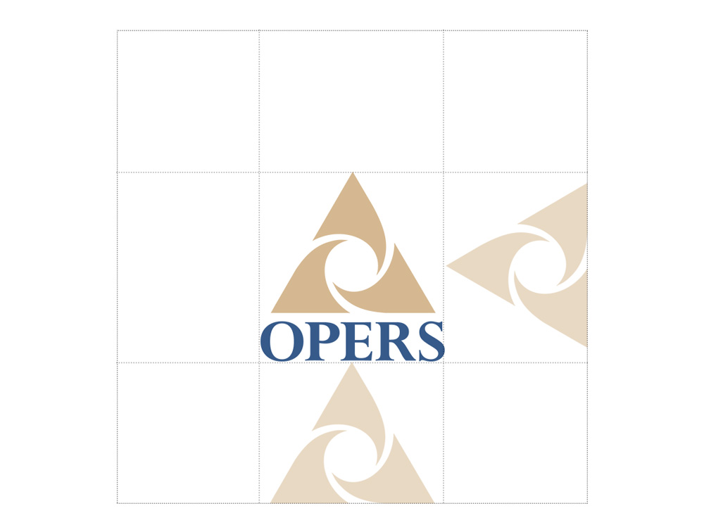
The OPERS logo should always be surrounded by a minimum area of space free of imagery and space. The clear space for the OPERS logo is defined as the height of the OPERS triangle. The clear space rule should be maintained as the logo is proportionately enlarged or reduced in size.

Sizing
The OPERS logo should be kept at a legible and reasonable size, both in print and digital formats.
- Print Minimum Size: 3/4" tall
- Web Minimum Size: 75px tall

Logo Dont's
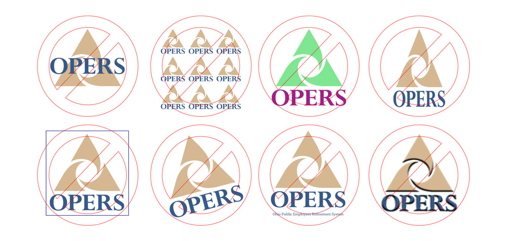
OPERS logo should never be altered in any way. Here are a few examples of what not to do with the OPERS logo:
DO NOT
- Alter the logo in any way
- Use only part of the logo
- Redesign, redraw, animate, modify, distort, or alter the proportions of the marks
- Rotate or render the marks three-dimensionallyDo not replace the approved typeface
- Enclose the marks in a shape or combine it with other design elements or effects
- Modify the size, position or relationship of any elementDo not add additional copy to the marks
